Now, Microsoft has only 11% of the search market right now. Everyone knows (or at least 9 of 10 people know) that it's current msn search engine is a waste of space and time. Yahoo ranks second, with around 25% of the search market, and I, for the most part, like the search engine itself. The page is too cluttered for my taste. Hence I join the almost 60% of searchers that use Google. It is fast, efficient, correct, uncluttered (if I want other stuff besides email, I'll go to those web pages). They have a dry sense of humor, and the best email service I've ever used.
But this is Microsoft LIVE. It's using the vaunted AJAX...the revolutionary tool that will make the internet come alive!! I've published before on what I think AJAX can do. Well, I thought, what better way to see if it is as good as it sounds.
The opening interface differs from google radically.
Here is Google's familiar minimalistic website. Here is Windows Live's website. You say, "Oh, that's minimalistic!" But no, that's it loading. I had to refresh the page twice before it loaded correctly. The correct page looks like this:
 Besides the wait, it isn't a bad webpage. The search bar stands out at the top, and the blue banner has three easy-to-click boxes (all of mine are checked) for what other things you want on the website. This is a great idea. Those of us who like the minimalist approach, can unclick all the boxes, and those who like the cluttered approach can keep them on. I left them on so you can see what extras LIVE offers.
You can see in the above screenshot that it has a few options. The Windows Live Gallery keeps you abreast of changes. The Gadget Gallery has small add-ons that function essentially like Widgets on a Mac. The Safety Center is an online version of your MS Windows XP security center. Then you get the list of happenings from MSNBC.com. As you scroll down, you notice a few more items:
You have E! News, an easy link to your live.com email account (which should use AJAX to compete against gmail but also offer drag & drop technology...I like that), the weather, and sports. All headings are expandable when clicked. Also, when you scroll over a news link, you get a summary bubble with three buttons: read, send to a friend, or blog this.

Beautiful. Absolutely great way to leave things uncluttered on the screen, and tie in email and blogging. The only downside is you are required to use a live.com email address and msnspaces.com blog. Hopefully, they will expand this, but I doubt it, since they want to keep people on their sites.
So I search...for "Vietnamese food." I figure, this is a very common search. Maybe not Vietnamese food specifically, but searching for food, restaurants, recipes, shopping makes up a large part of searches, and "Vietnamese food" both caters to those categories and is different enough to test the search engines.


You can see that the search results are pulled into one page. This allows for a couple differences. First, you can see that the results on these two pictures are the same, but one is more verbose. By using the cursor in the top right corner, you can choose between three settings: minimal (like you see on the left), normal (on the right), or verbose (which I found to be nothing more than usually a link to other similar pages). In contrast, what you see with Google is what you get.
 You get the standard title, pithy description, the address, and links to similar sites (offered in verbose Live) and cached images (not offered in Live, but helpful in areas of the world that may BLOCK a website, or if the website's server is having troubles).
Also useful to note is the number and types of returns. Windows Live returned 1,314,934 hits for my "Vietnamese food" search, and allows me to see about 2 at a time. I use the scrollbar on the right to move up and down. The scrollbar is kinda nice, esp. having the arrows on the bar, but it makes surfing difficult when all the pages are in one location.
When I surf, I usually visit sites in the first two google pages (first 20 sites) after that, i like to browse way in the back, by hitting one of the o's in "Gooooooogle." Browsing the smaller, peripheral sites is near impossible because you have to scroll down until you reach them. Google indexes 10 hits to a page, so you spend time loading pages every time you move on, but it's not any slower than Live, since Live doesn't allow you to jump around. I find that really annoying.
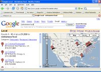
Another feature is the links to specific searches. Windows Live, as you see below, keeps them all in the AJAX feature on the main search site. Google (see above) has them as separate pages.
 My wife hates talking to me, because she says every sentence I say is "Yes...but..." or "Yes...however." Well, however, there are many downsides to Windows Live. One of the most glaring was the lack of pictures. When clicking on images, I got "there are no images for your search" in Windows Live, but I received this in Google:
 Not only am I now starving after seeing those pictures, but I find the total ABSENCE of pics in my Live search to be disturbing. That's a big error.
Second, the number of hits were drastically different. Live gave my 1,314,934 hits and Google 18,100,000. Now, I don't know anyone that will even visit one million sites, but it worries me that Google can find over 18 million sites that deal with my topic and Windows Live can't even manage one and a half. That result highlights a severe problem in the search engine that may be overlooked by my search, but would affect a more specific or obscure search.
Thirdly, and most important, what are the results of the search? I looked at the first 20 results because in Google a person rarely goes past the first 2-3 pages. Many of the results are different, but the differences aren't highlighted until you look at the first 10 of each News results.
Using the news link for windows live brought the first five search results:
1. san fran weekly listing restaurants,
2. boston online talks of vietnamese immigrants
3. college heights herald reminisces about a night on the town
4. knox pages talks of a cruise with a vietnamese-american
5. metro mix wants you to be a reviewer for foods
6. bangor daily talks about starch in rice
7. abc daily talks about gps units
8. reuters talks about the cruise with viet-americans
9. cattlenetwork.com talks about beef
10. kgw.com talks of ethnic food in vancouver
These news results have very little to do with Vietnamese food. Counter that with these results from Google:
1. Nhan Dan, Vietnam - Mar 7, 2006 Restaurateurs push Hanoi into the future with laquerware
2. Viet Nam News Agency, Vietnam - Feb 19, 2006 Vietnamese food and tourism arrive in India
3. Malaysia Star, Malaysia - Mar 6, 2006 interview with Ha Mai, celebrity vietnamese chef
4. VietNamNet Bridge, Vietnam - 16 hours ago price drops for rice sellers in vietnam
5. Long Beach Press-Telegram, CA - Mar 7, 2006 trying to find viet food in NYC
6. Bangor Daily News, ME - 13 hours ago exerpt focuses on viet fish sauce
7. Stars and Stripes, D.C. - Mar 7, 2006 asian bazaar in chech city
8. LA Weekly, CA - 7 hours ago restaurant listing
9. CattleNetwork.com, KS - 22 hours ago beef, but shows that someone has a viet wife (hence the search result)
10. Thanh Nien Daily, Vietnam - 22 hours ago viet scientists make safe alternative to borax for food
The results speak for themselves. For all the aesthetic pleasures that AJAX has offered Windows Live, it fails miserably compared to Google. The search engine is weak. No images returned, only about 7% of Google's hits returned in Live's search, and news results that are horribly off topic. Ladies and gentleman, take my advice--stick with Google. When it comes to finding things, it is still the best.


1 comment:
Hey, good review. I'll be surprised when either (1) Microsoft conquers search technology, or (2) Google builds an operating system from the ground up.
Of course, like we've talked about before, if the major applications all move to the web, then it won't much matter what operating system we use.
Post a Comment